Stop Shipping AI-Looking Websites: A Field Guide to Directing Claude Code
Design · Working with AI
There are some clear indicators to the majority of AI-generated websites. The fix is direction: a real spec, a plan, and your efforts precisely broken down.
I've shipped a lot of front-end with Claude Code over the last year, and I've also reviewed a lot that other people shipped with it. You learn fairly quick when the typical AI-defaults get used: the cream background, the high-contrast serif headline, the 3 feature cards with thin-line icons, the "Transform your workflow" hero. It looks nice, it's responsive, and generally clean code. It's also instantly recognizable as an AI agent-built site.
The bets part of this is that it is easily fixable. Claude Code is fully capable of producing unique work. It defaults to generic output for the same reason a session musician defaults to safe choices when you don't tell them what song you're making. Generic prompts get you generic results. Add specificity and the same model produces something else entirely.
Learn the AI defaults
Right now, AI-generated web design typically builds around three looks. Ask Claude Code to give you 3 different concepts, you'll almost always get these 3 handed to you. Once you see them, you'll start noticing it everywhere:
- The warm editorial. Cream background (somewhere around
#F4F1EA), a big high-contrast serif display face, a single terracotta accent. Tasteful, and completely generic because it shows up regardless of what the site is selling. - The dark acid. Near-black background, one bright acid-green or vermilion accent, lots of glow. Looks like every developer-tool landing page from the last two years.
- The broadsheet. Hairline rules everywhere, zero border-radius, dense newspaper-style columns, a tiny monospace eyebrow label over everything.
None of these are inherently bad. The problem is that they appear as defaults rather than choices, and the model uses them because it has no reason not to. If you ask for a yoga studio and a hot-sauce brand and get back two variations on the same cream-and-serif treatment, that's a dead giveaway.
The visuals are just the first part. The copy or "prose" (as AI always labels it) gives it away just as fast:
- Verbs like Transform, Elevate, Unlock, Supercharge, Empower.
- "Seamlessly" and "effortlessly," usually within the first two sentences.
- Em dashes everywhere, usually one per sentence.
- The feature triplet: three cards, three lucide icons, three two-word headings.
- Social proof with no proof: "Trusted by teams worldwide," "Join thousands of users."
- A hero that describes a category instead of a product: "The all-in-one platform for modern teams."
Then there's the structural clichés: the 01 / 02 / 03 numbered steps used on content that
isn't actually a sequence, the testimonial carousel nobody asked for, the FAQ accordion padding out
the page, the pricing table with the middle tier scaled up 5%.
If you can name these in a code review, you can stop them before they ship.
The main problem here is that you gave it nothing to build towards
"Build me a landing page for my app" is a request for the average landing page. The model has no subject to ground decisions in, so it produces decisions that work for any subject, which is the definition of generic.
Everything below is a way of giving Claude Code something specific to react to.
2 Different examples: same product, two heroes
Let's use the "Build me a landing page" from earlier in a request for a project tool for film production crews.
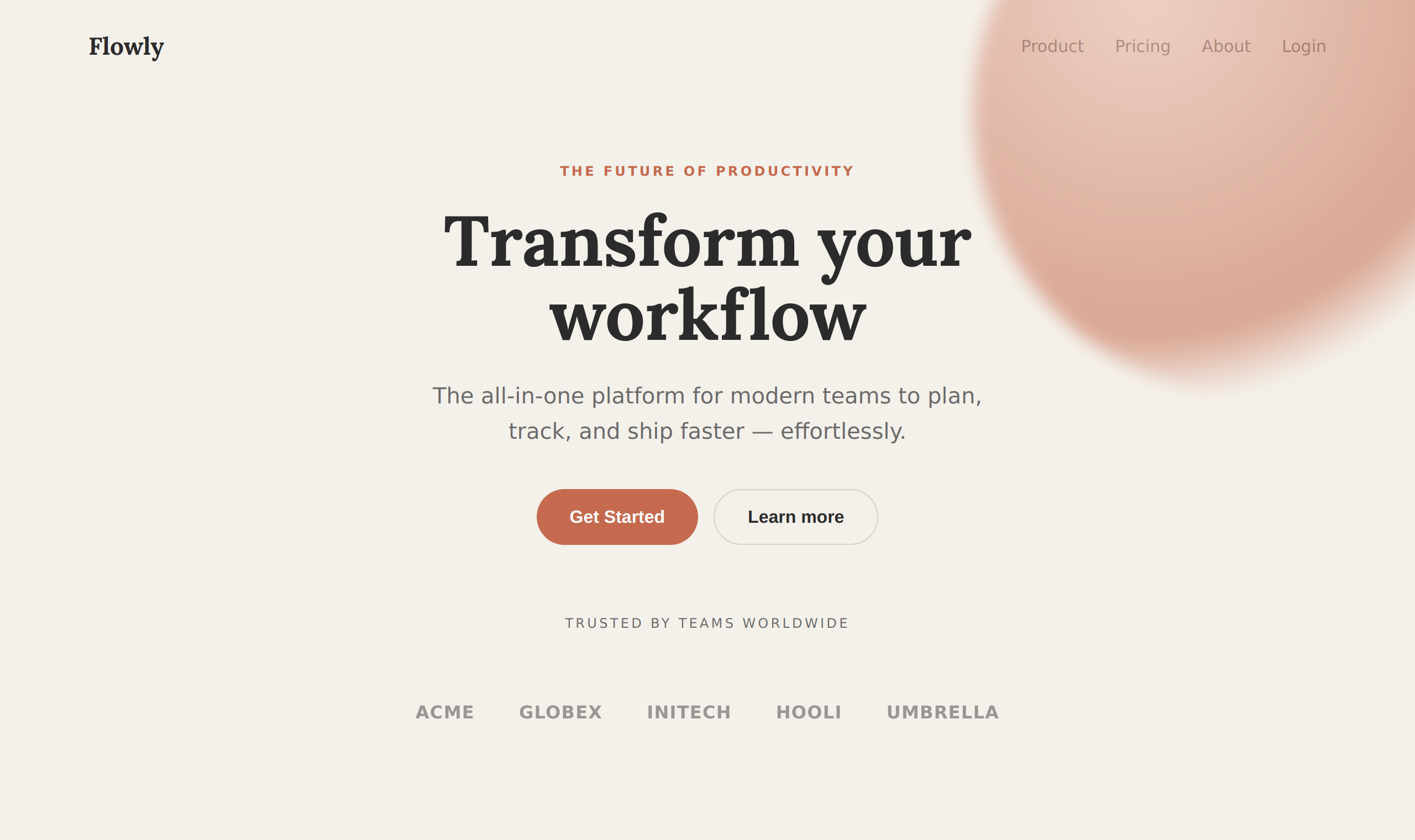
Before: the default
This is roughly what "make a modern, stylish landing page for my project" produces. Cream background, serif display, terracotta accent, a gradient blob, a category-not-product headline, and "Trusted by teams worldwide" over random company names. Yes it's clean, but it's also indistinguishable from a million other sites. More importantly, nothing in it says film.
<section class="hero">
  <div class="blob"></div> <!-- the obligatory gradient blob -->
  <p class="eyebrow">The future of productivity</p>
  <h1>Transform your workflow</h1>
  <p class="sub">The all-in-one platform for modern teams to plan,
     track, and ship faster — effortlessly.</p>
  <button class="btn-primary">Get Started</button>
  <button class="btn-ghost">Learn more</button>
  <p class="trusted">Trusted by teams worldwide</p>
  <div class="logos">ACME · GLOBEX · INITECH · HOOLI · UMBRELLA</div>
</section>
body { font-family: "Inter", sans-serif; background:#F4F1EA; color:#2b2b2b; }
h1 { font-family:"Lora",serif; font-size:64px; text-align:center; }
.blob { position:absolute; top:-160px; right:-120px; width:520px; height:520px;
border-radius:50%;
background:radial-gradient(circle at 30% 30%,#E7B7A6,#C56A4E 60%,transparent 72%);
filter:blur(8px); }
.btn-primary { background:#C56A4E; color:#fff; border-radius:999px; padding:15px 30px; }The giveaways: centered serif headline, the verb "Transform," the em dash before "effortlessly" in the subhead, the gradient blob, the pill button. Every one of those is a default the model reaches for on any given day.
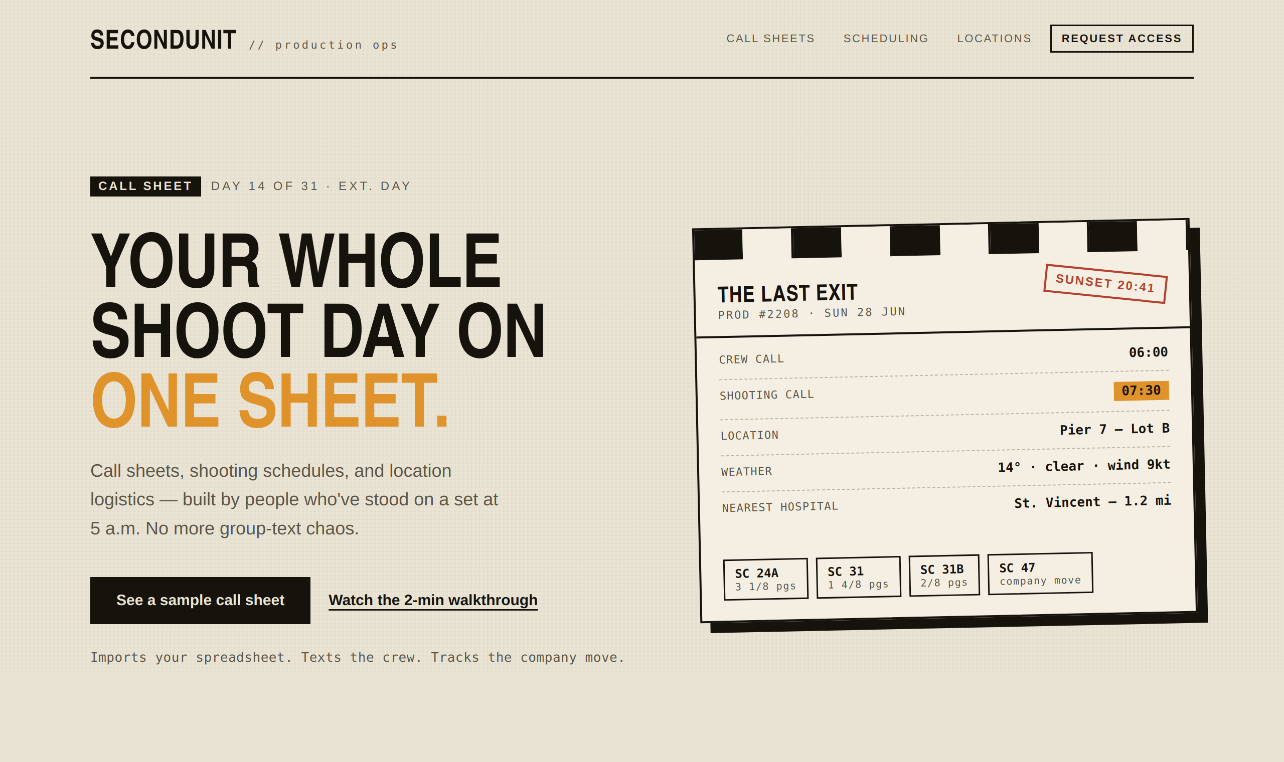
After: given proper direction
Same product, but now the prompt is doing the work, and the design is created from the artifact the audience already lives in: the call sheet. The signature element is a stylized call sheet (clapperboard stripe, tabular production data, a sunset stamp, scene tags). This one element now carries the page with intention. The type is a heavy condensed sans for display and a monospace for data. Not a serif in sight. The copy is now relevant to the audience it's meant for, and the CTA isn't just a standard "Get Started."
<section class="hero">
<div class="left">
<p class="eyebrow"><b>Call sheet</b> Day 14 of 31 · Ext. Day</p>
<h1>Your whole shoot day on <span class="amber">one sheet.</span></h1>
<p class="lede">Call sheets, shooting schedules, and location logistics,
built by people who've stood on a set at 5 a.m.
No more group-text chaos.</p>
<button class="btn-primary">See a sample call sheet</button>
<button class="btn-text">Watch the 2-min walkthrough</button>
<p class="reassure mono">Imports your spreadsheet. Texts the crew.
Tracks the company move.</p>
</div>
<!-- the signature: the hero IS a call sheet -->
<aside class="sheet">
<div class="clap"><span></span><span></span><span></span>…</div>
<header class="sheet-h">
<div><b class="title">THE LAST EXIT</b>
<span class="sub mono">Prod #2208 · Sun 28 Jun</span></div>
<span class="stamp">SUNSET 20:41</span>
</header>
<dl class="rows mono">
<div class="row"><dt>Crew call</dt><dd>06:00</dd></div>
<div class="row"><dt>Shooting call</dt><dd class="amberbox">07:30</dd></div>
<div class="row"><dt>Location</dt><dd>Pier 7, Lot B</dd></div>
<div class="row"><dt>Weather</dt><dd>14° · clear · wind 9kt</dd></div>
</dl>
<div class="scenes mono">
<span class="scene">SC 24A</span><span class="scene">SC 31</span>…
</div>
</aside>
</section>body { font-family:"Liberation Sans",sans-serif; background:#E9E3D4; color:#16130D; }
h1 { font-family:"Archivo","Arial Narrow",sans-serif; font-weight:800;
font-size:74px; line-height:.94; text-transform:uppercase; }
.amber { color:#E0922B; }
.mono { font-family:"DejaVu Sans Mono",monospace; } /* data reads as data */
.sheet { background:#F4EFE2; border:2px solid #16130D;
box-shadow:10px 10px 0 #16130D; transform:rotate(-1.2deg); } /* one bold move */
.clap span:nth-child(odd){ background:#16130D; } /* clapperboard stripe */
.btn-primary { background:#16130D; color:#E9E3D4; } /* square, not a pill */Nothing used for this site would work anywhere else, and that is exactly what you want.
The square
buttons, the grease-pencil shadow, the monospace logistics, the SUNSET 20:41 stamp. They
only make sense for this product, and those specifics are what give your site its uniqueness.
1. Write a real brief before you write a prompt
Before I prompt Claude, I write down three things and use them in every design:
- The concrete subject. "A tool that lets indie game studios track playtester feedback," rather than "a SaaS app."
- The audience. "Solo and small-studio developers who live in Discord and distrust marketing," rather than "users."
- The page's single job. What is the one thing this page must accomplish? Get a demo signup? Communicate trust to enterprise buyers? Sell one product?
That last one doesn't get the credit it deserves. So many times you'll encounter a site that is trying to convey too much. Narrow in on your main goal, and the end result usually comes out much better.
Weak prompt: "Make a modern landing page for my project management tool."
Strong prompt: "Landing page for a project tool built specifically for film production crews: call sheets, shooting schedules, location logistics. Audience is line producers and ADs who currently run everything off spreadsheets and group texts and are skeptical of 'project software.' The page has one job: convince them this was built by people who understand a set. Lean into the actual language of production: call times, scene numbers, the language of the slate."
The second prompt can't produce a generic page, because a generic page wouldn't satisfy it.
2. Make it plan the design before it writes any code
This has changed the way I've been working with agents. Don't let Claude Code jump right into coding the UI. Ask for a design plan first, and be specific about what the plan must contain:
"Before writing any code, give me a design plan: a palette of 4 to 6 named hex values, a type pairing (a characterful display face used with restraint, plus a body face, not Inter), a layout concept with a rough ASCII wireframe, and one signature element this page will be remembered by. Justify each choice against the brief. Don't write code yet."
This gets you a few things right away. You get to can the cream-and-serif default at the planning stage, not after waiting 15 minutes for it to build something you instantly know you dont want. You force the model to tell you why each choice fits this specific subject. And you get a " unique signature," the one memorable thing, which is exactly what generic sites lack.
When the plan comes back, apply one test: would I get roughly this same plan for a completely different brief? If yes, it'll still fall in deafult-land. Counter it with: "The palette and serif headline would fit any premium brand. Give me something that could only belong to this one."
3. Kill the defaults by name
The model instantly reaches toward certain concepts. Name them and forbid them, or it'll drift back. I keep a running list in my prompts:
- "Don't use Inter, and don't use a generic system font stack for display. Pick a display face with a point of view."
- "No gradient mesh blobs. No glassmorphism. No
01/02/03step numbers unless the content is genuinely sequential." - "Don't use cream-and-serif, dark-mode-with-one-acid-accent, or the hairline-broadsheet look. I want something derived from the subject, not a template."
- "Border-radius, shadows, and spacing should be deliberate values from a scale, not the framework defaults."
While this feels like too much, it seriously pays off. Blocking the easy paths is what forces it to find the interesting one. Another simple thing to do is make your own Claude Skill containing all these findings. On you next project, you can simply invoke the skill and all this gets excluded automatically.
4. Give it real content, then fix the copy yourself
Lorem ipsum and placeholder copy are where generic output hides. If you let Claude Code invent the words, you'll get "Transform your workflow" and three feature cards. Give it your real content copy and product names.
Review the copy as much as you would the design. Good interface copy names things by what the user controls, uses active voice ("Save changes," not "Submit"), and is specific instead of witty. A button that says "Publish" should produce a toast that says "Published," not "Success!" If the empty states and error messages read like a person apologizing, rewrite them in the product's voice. Copy is design material. It can make a page feel as templated as any layout choice.
5. Force a full self-critique review
After the first build, before you touch anything yourself, make the model audit its own work against the very defaults we listed:
"Critique this design as if you're a design lead who hates generic AI output. Where does it look templated? Which choices would appear regardless of the brief? What's the one element a person would actually remember? Then revise, and tell me what you changed and why."
Claude Code is genuinely good at this when you point it at the right target. The first pass is the model playing it safe; the critique pass is where the real work happens. I often run this twice.
6. Iterate from screenshots
Reading the code tells you what's there; it doesn't tell you what it looks like. If your setup lets the model take and view screenshots, use it. One screenshot replaces a lot of guessing. "Here's how it rendered; the hero feels cramped and the accent color is doing nothing. Fix the rhythm" is a far better instruction than anything you can give blind. If you can't automate screenshots, paste them in yourself. The visual feedback loop is where good design actually happens.
7. Lock your conventions in a project file
For anything you deem reusable elsewhere, put your design system in a CLAUDE.md (or
equivalent) at the repo root: the palette, the type scale, the css tokens, the component
patterns, and a short "things we never do" list. This stops the slow drift back toward defaults
across a long session, and it means every new component inherits your point of view instead of the
model's. Treat it like your very own styleguide that your having the model enforce.
8. Make a single section shine
Once you've dropped the defaults, it gets very easy to run wild on th entire site. The best work picks one signature move (an unusual hero, a distinctive type treatment) and keeps everything around it quiet and disciplined. A page where everything is loud and in your face ends up coming across as noise. A page where nothing at all grabs attention reads as generic. One memorable element, surrounded by support, is what you're aiming for. Tell Claude Code this explicitly, because left alone it tends to either play it safe or decorate everything with excessive animations.
Things to watch for
Drift over long sessions. The further you get from your original spec, the more the model may drift slowly back to defaults. New components added late in a session are the most likely to come back generic. Since you now have a CLAUDE.md file, leverage that by simply starting a fresh, new session.
CSS that cancels itself out. When the model generates a lot of CSS, watch for
selector-specificity collisions, a type-based selector like .section fighting an
element-level one like .cta, especially around section padding and margins. The page
looks subtly broken and the cause isn't obvious. Ask for the spacing system to live in as few places
as possible.
Don't ever skip quality for something pretty. Distinctive doesn't mean inaccessible. In today's world, there are some absolutes that every site really should nail down. Responsive down to mobile, visible keyboard focus, sufficient contrast, and reduced-motion support are just some of the few important ones off hand. A bold design that fails on a phone or for a keyboard user is just broken, so put those four in the brief where they can't be traded away for finesse later.
Heavy animation is becoming another big giveaway. Scattered hover effects and entrance animations on every element scream "generated." Motion should serve one purpose and not be used just for the sake of it. More animation is not more design.
The "uniqueness" that's actually just a different default. Sometimes you reject the cream-and-serif look and the model hands you the dark-acid look instead. You're now just getting handed another style of default that a model typically reaches for when 1 idea gets rejected. Keep pushing until the direction comes from the subject itself.
The mindset that ties it together
Every technique here is the same move repeated: replace ambiguity with specificity, and make the model commit to choices it can justify against this brief rather than any brief. Generic output isn't Claude Code failing. It's Claude Code correctly answering an under-specified question. Give it a real subject, a point of view to react to, a chance to plan, and a reason to critique itself, and it'll produce work that is something you can call your own.
That's the best part of using AI for this type of work. Agents can put out code faster than you can blink, so spend your efforts in designing what you want these models to accomplish for you.